As data becomes an increasingly pivotal part of decision-making processes in various industries, the necessity for effective methods of presentation cannot be overstated. A commonly utilized tool for this purpose is a line chart. If you’re unsure what are line charts used for, think of their role in finance, marketing analytics, or weather forecasting, where detecting trends is of utmost importance. Below, we delve into the importance of this graphical representation, its usage across different sectors, as well as its advantages and disadvantages.
Understanding Line Graphs: A Detailed Overview
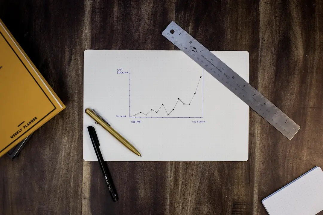
At its core, a line chart (or graph) is a type of graphical representation that displays data as a series of points marked by ‘x’ or ‘o’ symbols, connected by straight lines. These graphs typically employ two axes, with the vertical (y-axis) representing numerical values and the horizontal (x-axis) indicating time or categories.
Line charts are a favored method of visualizing data over time, revealing trends and patterns in the data set. They offer a clear and concise way to depict changes, making them a popular choice for data representation in various fields.
In contrast to other forms of graphs, line charts are particularly adept at demonstrating the overall trend rather than individual values, providing a holistic picture. By highlighting the rise and fall of data points over a specified period, they give users valuable insights into the data patterns.
Unfolding the Core Principle of Line Charts
The premise of line charts hinges on the correlation between two variables. In these graphs, one independent variable is plotted on the x-axis, while the dependent variable is plotted on the y-axis. The resulting ‘line of best fit’ illustrates the relationship between these two variables.
Given their simplicity and ease of interpretation, line charts are an ideal choice for showcasing linear relationships. The slope of the line plot demonstrates the strength and direction of the relationship—rising lines signify an increase, whereas falling lines suggest a decrease.
Another intriguing aspect of line charts is their adaptability. They can handle both continuous and categorical data, plus they’re equipped to manage large amounts of data without becoming overly cluttered. This broad range of applicability makes line charts a versatile tool for data visualization.
While the foundations of line charts are straightforward, effective utilization requires a keen understanding of their principles. Regardless of the data being processed, observing trends and spotting anomalies becomes significantly easier with a fundamentally sound comprehension of line charts.
Advantages & Disadvantages of Using Line Charts

While line charts offer immense value in trend visualization and pattern discovery, they’re not devoid of limitations. On the positive side, their simplicity, versatility, and ease of interpretation make them a powerful tool for analyzing linear relationships and time-series analysis.
They are particularly suitable when dealing with large datasets, providing an overall trend and enabling the detection of outlier values or sudden spikes in the data. Line charts also simplify the understanding of correlating data variables.
However, one of the pitfalls of line charts is their inability to display individual data values effectively. A line chart offers a holistic picture, often at the expense of precise details. This lack of granularity can be impactful when individual data points hold significant importance.
Additionally, with multiple lines on the same chart, interpretation can become complicated, leading to confusion. It’s important to be aware of these factors when choosing to display data using line charts.
Altogether, line charts should be used wisely to truly deliver value. Consider the nature and size of your data, the aim of your analysis, and the pros and cons discussed. Above all, never underestimate the power of data visualization in enhancing understanding and decision-making.
Hey Everyone! This is Mia Shannon from Taxes. I'm 28 years old a professional blogger and writer. I've been blogging and writing for 10 years. Here I talk about various topics such as Fashion, Beauty, Health & Fitness, Lifestyle, and Home Hacks, etc. Read my latest stories.